One-Page Checkout vs Multi-Step Checkout: What Converts Better?
Short answer: One-page checkout converts better for low-to-mid-priced products, mobile-first audiences, and repeat buyers who value speed. Multi-step checkout converts better for high-value, complex, or B2B purchases where buyers need reassurance. Neither wins automatically — the better-optimized flow for your customers is the one that converts.
Ecommerce has never been more competitive than it is today. Brands are spending more on ads, fighting harder for attention, and investing heavily in product quality. Yet, despite all this effort, a large percentage of customers still abandon their carts right before completing a purchase. The reason is often not pricing or product—it’s the checkout experience.
Checkout is the most critical moment in the ecommerce journey. It is the point where browsing turns into revenue. Even small issues during checkout—too many steps, confusing forms, slow loading, or poor mobile usability—can undo all the hard work done earlier in the funnel. That’s why checkout page optimization has become a top priority for ecommerce brands focused on growth.
One of the most debated questions in ecommerce today is one page checkout vs multi step checkout. Some brands swear by single-page simplicity, while others prefer structured, step-by-step flows. But which one actually converts better? And more importantly, how should brands decide what works best for their customers?
This guide follows the same practical, insight-driven writing pattern used in Shopaccino’s top-performing blogs. Instead of giving a one-size-fits-all answer, we’ll explore real customer behavior, conversion psychology, and ecommerce checkout best practices to help you make the right decision.
Why Checkout Page Optimization is a Revenue Lever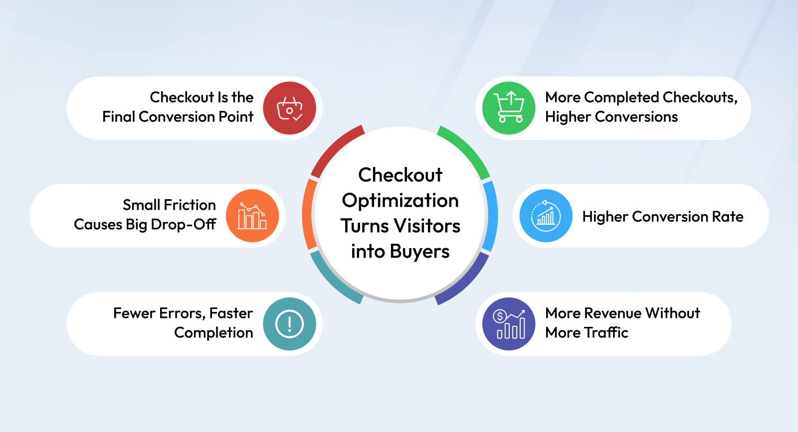
Many ecommerce brands focus heavily on traffic generation—SEO, ads, influencers, and marketplaces. While traffic is important, it’s only half the equation. If your checkout is inefficient, you are paying to lose customers.
Checkout page optimization is the process of improving the design, structure, speed, and usability of the checkout experience so more users complete their purchases. The goal is simple: reduce friction and increase confidence.
A well-optimized checkout helps to:
- Reduce abandoned cart
- Improve ecommerce conversion rate
- Increase revenue without increasing traffic
- Create a smoother buying experience, especially on mobile
Studies consistently show that a significant percentage of users abandon carts due to checkout-related issues such as unexpected costs, lengthy forms, forced account creation, or lack of preferred payment options. This makes checkout optimization one of the highest ROI activities in ecommerce.
Understanding the Customer Mindset at Checkout
To understand why checkout design matters so much, it’s important to understand what’s happening in the customer’s mind at this stage.
By the time a user reaches checkout, they have already:
- Evaluated the product
- Compared prices or alternatives
- Decided that they want to buy
At this point, the customer is looking for reassurance, clarity, and speed. Any uncertainty—such as unclear delivery timelines, hidden charges, or confusing steps—can trigger hesitation. When hesitation increases, so does abandoned.
This is why ecommerce checkout best practices focus less on persuasion and more on removing doubt. Checkout is not the place to upsell aggressively or overwhelm users with information. It is the place to make completion feel effortless.
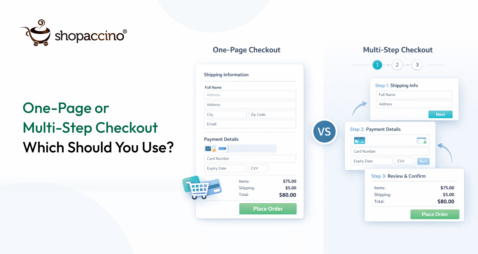
What Is One-Page Checkout in Ecommerce?
A one page checkout ecommerce flow presents all checkout elements—customer details, shipping information, payment options, and order summary—on a single page. Instead of navigating through multiple screens, the user completes the entire process in one continuous view.
At first glance, one-page checkout feels like the obvious winner. Fewer clicks, faster completion, and a sense of simplicity. This is why many modern D2C brands adopt this approach, especially when speed and convenience are core to their value proposition.
However, the effectiveness of one-page checkout depends heavily on execution.
Why One-Page Checkout Can Improve Conversion Rates
When implemented correctly, one-page checkout can significantly improve the e-commerce conversion rate. Here’s why:
1. Reduced Perceived Effort
Even if the total number of fields remains the same, displaying them on a single page often feels easier to users. There is no sense of “long process” or commitment to multiple steps.
2. Faster Checkout Completion
Users don’t have to wait for pages to load between steps. This is especially important in regions with inconsistent internet speeds or on mobile devices.
3. Better for Returning Customers
Repeat buyers value speed more than guidance. One-page checkout allows them to complete purchases quickly without unnecessary interruptions.
4. Strong Performance on Mobile (When Optimized)
With proper mobile checkout optimization—such as collapsible sections, autofill support, and large touch targets—one-page checkout can work very well on smartphones.
The Hidden Challenges of One-Page Checkout
Despite its advantages, one-page checkout is not automatically better. Poorly designed single-page checkouts can actually increase friction.
Common issues include:
- Information overload on smaller screens
- Long scrolling, especially on mobile
- Difficulty identifying errors in form fields
- Slower load times due to heavy scripts
If users feel overwhelmed or lose track of where they are in the process, the simplicity advantage disappears. This is why one-page checkout requires thoughtful UX design, not just fewer pages.
One-Page vs Multi-Step Checkout UX: How Design Affects Completion
Checkout UX is the real deciding factor between one-page and multi-step flows — not the number of pages. The same fields can convert or repel depending on layout, clarity, and how errors are handled.
One-page checkout UX works best when the single view stays scannable: clear visual hierarchy, collapsible sections, generous spacing, and inline validation that catches errors the moment they happen. When a one-page layout becomes a long, dense wall of fields, the simplicity advantage disappears and users stall.
Multi-step checkout UX wins on focus and reassurance. Showing one task at a time lowers cognitive load, isolates errors within each step, and uses progress indicators like "Step 2 of 4" to keep users committed to finishing. The trade-off is more transitions, so each step must load fast and feel effortless.
The practical takeaway: judge the flow by how confident and unblocked a real user feels at each moment, not by page count. A well-designed multi-step flow beats a cluttered single-page one, and a clean single-page flow beats a sluggish multi-step one.
Mobile Checkout Optimization: Where One-Page Checkout is Tested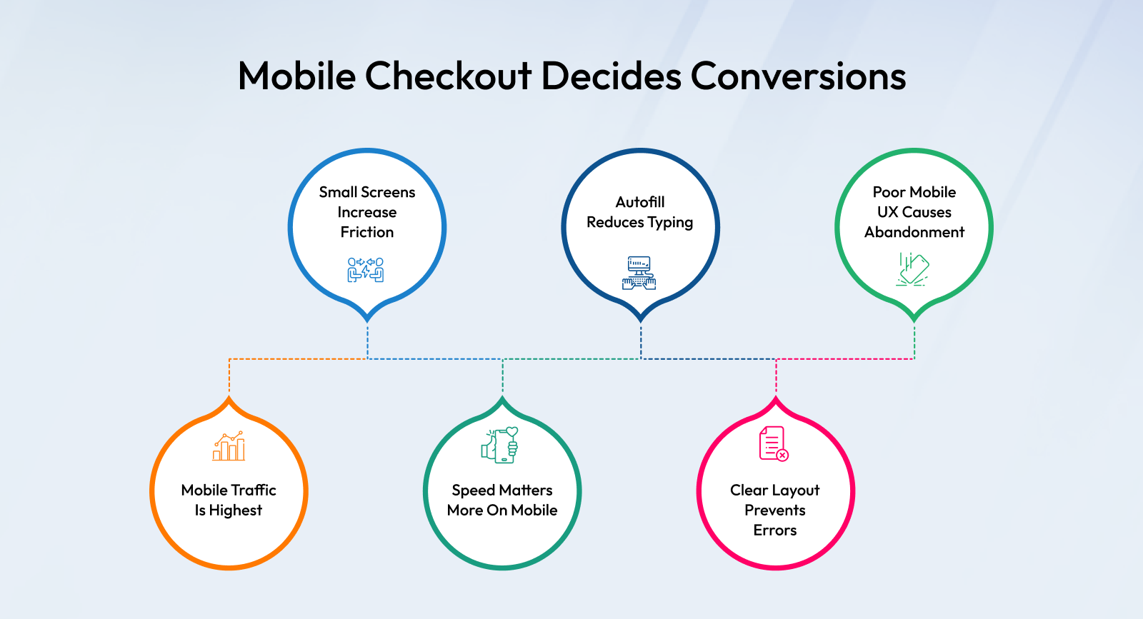
Mobile commerce continues to dominate ecommerce traffic, but mobile conversion rates often lag behind desktop. Checkout experience is a major reason for this gap.
Mobile checkout optimization focuses on making the checkout process easy to complete on small screens with limited attention spans. For one-page checkout, this means:
- Breaking sections into expandable blocks
- Minimizing typing through autofill
- Using clear visual hierarchy
- Ensuring fast page load speed
A one-page checkout that works beautifully on desktop but feels cramped or confusing on mobile will struggle to deliver results.
When One-Page Checkout Works Best
Based on real-world ecommerce behavior, one-page checkout tends to perform better when:
- Products are low to mid-priced
- Purchase decisions are quick
- The audience is mobile-first
- Customers are already familiar with the brand
In these cases, speed matters more than step-by-step reassurance.
Setting the Stage for Multi-Step Checkout
While one-page checkout focuses on speed and simplicity, multi-step checkout takes a different approach—guiding users through the process in structured stages.We’ll explore how multi-step checkout works, when it outperforms single-page flows, and how to compare both models objectively.
We’ll also dive deeper into one page checkout vs multi step checkout using real conversion factors, along with ecommerce checkout best practices that apply regardless of which model you choose.
Choosing the Right Checkout Flow That Converts
What Is Multi-Step Checkout and When Does It Work Best?
Multi-step checkout is a checkout flow where the purchase process is divided into multiple, clearly defined steps instead of being completed on a single page. Typically, these steps include:
- Customer information
- Shipping details
- Payment method
- Order review and confirmation
Each step focuses on one action at a time, guiding the customer through the process in a structured and predictable way.
The core strength of multi-step checkout lies in clarity and reassurance. Rather than asking customers to absorb everything at once, it allows them to process information gradually. This approach aligns well with how people make decisions when there is money, trust, or complexity involved.
Real-World Use Cases Where Multi-Step Checkout Performs Better
Multi-step checkout is especially effective in the following situations:
- High-value purchases
When customers are spending more, they want time to review details carefully. A step-by-step flow reduces anxiety and builds confidence. - Complex or customized products
Orders that involve size selection, customization, add-ons, or special instructions benefit from a structured checkout. - B2B and wholesale ecommerce
Business buyers expect a more formal, information-driven checkout experience. Multi-step flows feel more natural in these scenarios. - First-time buyers
New customers are more cautious. Clear steps and progress indicators reassure them that they are moving through a secure and logical process.
In these cases, slowing the process slightly can actually improve ecommerce conversion rate, because users feel more confident completing the purchase.
One Page Checkout vs Multi Step Checkout: A Deep Comparison
The debate around one page checkout vs multi step checkout is often oversimplified. The real difference lies in how users think, feel, and behave at checkout.
| Scenario | Better-fit checkout flow |
|---|---|
| Low-to-mid-priced products | One-page |
| Mobile-first audience | One-page (when optimized) |
| Repeat / returning buyers | One-page |
| High-value purchases | Multi-step |
| Complex or customized products | Multi-step |
| B2B and wholesale | Multi-step |
| First-time / cautious buyers | Multi-step |
1. User Psychology: Speed vs Reassurance
One-page checkout is designed for speed. Everything is visible at once, and users can complete their purchase quickly. This works well when customers already trust the brand.
Multi-step checkout focuses on reassurance. By guiding users through a sequence, it reduces uncertainty and makes the process feel safer—especially for new or hesitant buyers.
Key takeaway:
- Trusted brands → one-page checkout performs better
- New or complex brands → multi-step checkout builds confidence
2. Cognitive Load and Information Overload
In a one-page checkout ecommerce flow, all fields are visible at once. If not designed carefully, this can feel overwhelming—especially on mobile.
Multi-step checkout reduces cognitive load by showing only what’s needed at each step. Users are less likely to feel confused or stressed, which helps reduce abandoned cart.
Key takeaway:
Less information at a time often leads to better focus and completion.
3. Error Handling and Form Validation
Form errors are a major friction point at checkout.
- In one-page checkout, errors can be easy to miss, particularly on smaller screens.
- In multi-step checkout, errors are isolated within a step, making them easier to spot and correct.
This small difference can have a big impact on checkout completion rates.
4. Drop-Off Behavior
One-page checkout has fewer visible exit points, but users may abandon early if the page feels too long or complex.
Multi-step checkout introduces more steps, but with clear progress indicators like “Step 2 of 4,” users feel committed to finishing the process.
Key takeaway:
Drop-offs depend more on clarity than the number of steps.
5. Performance and Speed
One-page checkout relies heavily on page performance. If the page becomes heavy or slow, conversions suffer quickly.
Multi-step checkout spreads the load across pages. On slower networks, this can sometimes feel smoother—especially for mobile users.
This is why checkout page optimization is critical regardless of the checkout structure.
Mobile Checkout Optimization: India and Global User Behavior
Mobile checkout optimization is no longer optional. In India and many global markets, mobile devices account for the majority of ecommerce traffic—but also the highest abandoned rates.
Mobile Checkout Behavior in India
Indian ecommerce users are predominantly mobile-first. Key behavioral traits include:
- Short attention spans
- High sensitivity to slow loading pages
- Strong preference for autofill and digital wallets
If checkout feels slow or confusing, users abandon quickly—often without a second attempt.
Global Mobile Checkout Expectations
Across global markets, mobile users expect:
- Minimal typing
- Clear visual hierarchy
- Fast and secure payment options
This means checkout flows must be designed mobile-first, not adapted from desktop later.For brands looking to improve mobile conversion, investing in a strong Ecommerce App Development Service can make a major difference. A well-built ecommerce app offers faster checkout experiences, personalized user journeys, better payment integrations, and smoother navigation compared to mobile websites, helping businesses reduce cart abandonment and improve customer retention.
Optimizing Checkout for Mobile Users
Effective mobile checkout optimization includes:
- Large, touch-friendly input fields
- Collapsible sections for one-page checkout
- Fast transitions between steps for multi-step checkout
- Clear and visible error messages
A checkout that works well on desktop but poorly on mobile will struggle to convert in 2026.
Ecommerce Checkout Best Practices That Drive Conversions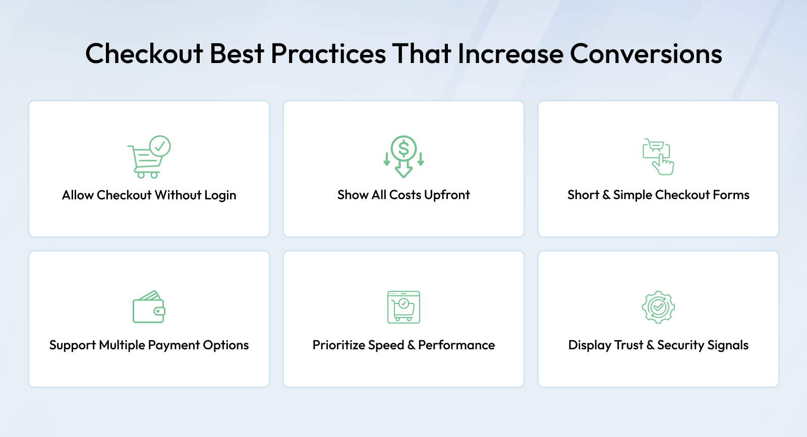
No matter which checkout flow you choose, these e-commerce checkout best practices consistently help improve performance.
1. Offer Guest Checkout
Forcing account creation is one of the fastest ways to lose customers. Guest checkout removes unnecessary friction.
2. Show All Costs Early
Unexpected shipping or tax charges are a leading cause of abandoned. Transparency builds trust.
3. Minimize Form Fields
Ask only for information that is absolutely necessary. Every extra field increases drop-off risk.
4. Support Multiple Payment Options
Payment preferences vary widely. Offering familiar methods increases completion rates.
5. Prioritize Speed
Faster checkout pages directly help improve ecommerce conversion rate.
6. Use Clear Visual Cues
Buttons, labels, and progress indicators should guide users naturally through checkout.
7. Reinforce Trust
Security badges, clear return policies, and visible contact information reassure customers during the final decision.
Following these practices helps reduce abandoned cart, whether you use one-page or multi-step checkout.
Using Data to Choose the Right Checkout Strategy
By now, one thing should be clear: there is no universally perfect checkout flow. The brands that consistently grow are not the ones copying competitors—they are the ones using data and customer behavior to guide checkout decisions.
Instead of asking “Which checkout is better?”, high-performing ecommerce teams ask smarter questions:
- At which step are users dropping off?
- Is abandoned higher on mobile or desktop?
- Do first-time buyers behave differently from repeat customers?
- Does conversion rate drop as order value increases?
Answers to these questions reveal far more than assumptions ever will.
A Practical Checkout Decision Framework
You can use this simple framework to decide what to test:
- If speed and impulse buying drive most sales → start with one-page checkout
- If trust, reassurance, or complexity matters → start with multi-step checkout
- If mobile traffic dominates → prioritize mobile checkout optimization first
- If abandoned is high → simplify before redesigning
In many cases, brands discover that the problem isn’t the checkout type—it’s poor execution.
Why Continuous Checkout Optimization Matters
Checkout optimization is not a one-time project. Customer expectations, devices, payment habits, and even internet speeds change constantly.
Brands that treat checkout as a “set and forget” feature slowly lose conversions over time.
Continuous optimization includes:
- A/B testing checkout layouts
- Monitoring where users abandon forms
- Reviewing mobile-specific friction points
- Updating payment options based on user preference
Even small improvements—such as reducing one form field or improving page speed—can lead to measurable gains in conversion rate.
This is how brands sustainably improve ecommerce conversion rate without increasing ad spend.
Checkout Trends That Will Shape Ecommerce in 2026
As ecommerce evolves, checkout experiences are becoming faster, smarter, and more adaptive. Some key trends shaping checkout in 2026 include:
1. Distraction-Free Checkout Experiences
Brands are removing unnecessary elements like navigation menus and banners during checkout to keep users focused on completion.
2. Performance-First Design
Speed is becoming a competitive advantage. Lightweight checkout experiences convert better, especially on mobile networks.
3. Adaptive Checkout Flows
Modern checkout systems adjust based on customer type, device, or order value—offering flexibility instead of rigid structures.
4. Smarter Error Handling
Checkout experiences now guide users to fix errors instantly without breaking flow or forcing page reloads.
To support these trends, ecommerce platforms must offer flexibility and performance. Platforms like Shopaccino allow businesses to optimize checkout flows without locking themselves into a single structure.
Final Verdict: What Converts Better?
So, what truly converts better—one-page checkout or multi-step checkout?
The real answer is simple:
The checkout experience that is best optimized for your customers converts better.
One-page checkout works exceptionally well when speed, familiarity, and mobile convenience matter most.
Multi-step checkout performs better when trust-building, clarity, and complex decision-making are involved.
Neither approach succeeds without proper checkout page optimization, strong mobile checkout optimization, and adherence to ecommerce checkout best practices.
Brands that focus on reducing friction instead of reducing steps consistently see better results.
FAQs
Both can convert well depending on product type, audience trust, and device usage.
No. One-page checkout works on mobile only when designed with collapsible sections and minimal scrolling.
Yes. New users often need reassurance, while returning users value speed
There is no fixed number. The goal is clarity and ease, not fewer steps.
Yes. Changes in user behavior and devices require regular review and optimization.
Traffic brings visitors, but checkout optimization turns them into revenue.
When abandonment rises, mobile conversions drop, or the business model changes.