
Online Course Website Development: Complete Guide to Build and Launch
Online learning has moved from a side experiment to a mainstream channel. Buyers everywhere are paying for training, skill development, certifications, and specialised knowledge through websites they discovered last week. The audience is no longer limited to professional learners. Hobbyists buy cooking courses. Parents buy parenting workshops. Working adults buy weekend masterclasses. Students buy supplementary tutoring. Every meaningful skill area now has an online course economy growing around it.
Educators, trainers, coaches, and businesses are responding by launching their own course-selling websites instead of relying on large marketplaces. The reasons are straightforward. A branded website lets you own the student relationship, set your own pricing, choose your own design, communicate directly, and build a long-term audience that returns for the next course you publish. Marketplaces give you reach but take a meaningful commission and own the customer.
This is where Online Course Website Development becomes a real business decision. You are no longer just publishing content. You are building a website that handles enrolments, payments, customer accounts, course access, and ongoing communication. A modern ecommerce platform makes most of this work straightforward, since the same software that runs an online store can also run a course selling website, with each course listed as a product in the catalogue.
This guide walks through how to plan, build, launch, and manage a real online course website. You will learn what features actually matter, how the workflow looks from setup to launch, how to design a website that students find easy to use, and where Shopaccino fits in as SaaS ecommerce software that anyone can use to create a branded course selling website. The focus is on website development and platform operations, not on how to make a course itself.
What is Online Course Website Development?

Online Course Website Development is the process of building a website where students can browse, purchase, and access online courses. It is essentially an e-commerce website development with one specific product category. The product being sold is not a physical item or
a downloadable file, but access to a structured set of lessons, usually delivered through video and supporting resources.
A course website typically combines three core capabilities. First, an ecommerce storefront where students browse courses, see pricing, and check out. Second, a customer account area where students log in, view their purchased courses, and pick up where they left off. Third, a content delivery setup that shows the course videos and resources only to students who have paid for them.
How Course Websites Function
In practical terms, the workflow looks like this. The educator creates the website, adds each course as a product, sets a price, and uploads or embeds the lesson content. A visitor lands on the website, browses courses, picks one, and pays through the checkout. The platform creates a customer account, sends a welcome email with login details, and unlocks access to the course inside the student's account area.
From there, the student logs in whenever they want, opens the course page, and works through the lessons at their own pace. The platform tracks the order, the customer, the payment, and the access permission. The student stays inside the branded website throughout the experience.
Marketplaces vs Independent Course Websites
Course marketplaces are useful for discovery. Students browse thousands of courses from many creators, compare options, and buy through a familiar interface. The trade off is that the marketplace owns the customer relationship, takes a commission on every sale, sets the pricing rules, and controls the discovery algorithm. An independent course selling website gives you full ownership of the brand, the customer data, the pricing, and the experience. Both have their place, but for serious educators the independent website becomes the long term home of the business.
Why Businesses Prefer Their Own Course Platform
Owning the website means owning the audience. You can email past students directly when you launch a new course. You can offer custom pricing for corporate buyers. You can adjust the design to reflect your brand. You can build a loyal community that returns for the next thing you publish. None of this is possible on a marketplace where the platform sits between you and your customer.
Why Businesses and Educators Need an Online Course Website
Beyond ownership, a branded course website solves specific operational challenges that course sellers face. Each one of these benefits is a practical improvement over relying on third party tools or marketplaces.
Direct Student Management
A branded website keeps every student record in one place. You can see who enrolled in which course, when they last logged in, how many lessons they have completed, and what they have asked about in support tickets. This visibility makes course operations far easier to manage than scattered spreadsheets or marketplace dashboards.
Brand Ownership
Your course website carries your name, your colours, your voice, and your visual identity. Students remember you, not the platform that sits between you and them. When the next course launches, they recognise your brand and trust the purchase. Brand ownership compounds over the years in a way that marketplace storefronts cannot.
Flexible Pricing Models
A branded website lets you set pricing the way that works for your business. One time purchases. Bundles where buying two courses saves a percentage. Discount codes for partners. Corporate pricing for B2B buyers. Marketplaces typically restrict these options to whatever fits their algorithm.
Centralised Content Management
Course updates, pricing changes, new lesson uploads, banner promotions, and customer communication all happen from the same dashboard. There is no need to log in to four different services. This single source of operations reduces the time and friction of running a course business.
Improved Learning Experience
Your website is your control over the student experience. Clean layouts, clear progress indicators, fast loading lessons, smooth video playback, and a mobile-friendly website that works well on phones all combine to create a learning environment students actually enjoy. Marketplaces optimise for their algorithm. Your website can be optimised for your students.
Essential Features Required in an Online Course Website
Course websites have specific feature needs that go beyond a basic product website. Each of the features below plays a real role in either selling the course, delivering it, or supporting the student afterward.
Course Listing Pages
Each course needs a dedicated page that explains what the student will learn, who it is for, what the modules cover, who is teaching it, and how much it costs. Strong listing pages include a clear outcome promise, a structured module overview, sample lesson previews, instructor credentials, and student testimonials where available.
Student Login System
A reliable student login system is non negotiable. Every paid student needs a personal account where they can log in, view their purchased courses, and pick up lessons from where they left off. The system should also handle password recovery, email verification, and account management without you stepping in for every request.
Course Access Management
Course access management controls who can see which course content. Only a student who has purchased a specific course should be able to access its lessons. The platform should automatically grant access on payment, hold access until payment clears for COD or bank transfer orders.
Secure Checkout
The checkout process must be encrypted, PCI compliant, and protected against common fraud patterns. Students entering payment details need to feel confident their information is safe. SSL certificates, verified payment processors, and clean error handling are all standard expectations on a serious course website.
Payment Gateway Integration
A secure payment gateway integration is the heart of course commerce. The website should support multiple payment methods that match where your students are. Cards, UPI, wallets, net banking, EMI options, and international gateways for cross border buyers. Native integrations are more reliable than third party plugins, which often break on updates.
Video and Digital Content Support
The platform must support digital course delivery through video lessons, downloadable resources, worksheets, and links to external materials. Video content is typically hosted on a paid video hosting service that restricts viewing to your domain, and the platform embeds the player into the course page using the video URL. This separates content storage from content selling, which is the standard pattern for course websites today.
Mobile Responsiveness
Most students now access course content on phones, especially for shorter lessons watched between other activities. The website must look and work well on mobile screens, with readable text, smooth video playback, easy navigation, and a checkout that does not break on small displays.
Automated Notifications
Order confirmations, welcome emails, lesson availability alerts, course completion messages, and reminder emails for inactive students all need to work without manual effort. Automated notifications keep students engaged and reduce support load on your end.
Order and Enrolment Management
Every enrolment is essentially an order. The platform should track each one with full details, including the student, the course, the payment status, the access granted, and any refund or upgrade activity. A single order screen that shows all of this makes course business operations far easier to run.
How Shopaccino Helps You Build an Online Course Website
Shopaccino is SaaS ecommerce website builder software that anyone can use to create a branded website and sell products online. The same platform that someone uses for clothing, electronics, food, or home decor can also be used to sell access to online courses, by listing each course as a digital product in the catalogue.
Here is a practical look at the features Shopaccino provides that support online course website development.
Customisable Themes
Shopaccino comes with a library of themes you can customise through the dashboard. The colours, fonts, banners, and section layouts can all be adjusted to match your brand, so the website carries your identity rather than a generic platform style.
Responsive Website Design
Every Shopaccino theme is built with responsive website design in mind. The same course pages, dashboards, and checkout flows adapt automatically to look right on desktops, tablets, and phones, without requiring separate designs for each screen size.
Digital Product Support
Courses can be set up as digital products in the Shopaccino product catalogue. Each course is a product with a title, description, pricing, images, and content area. You decide the price, set the access rules, and add the lesson content directly through the dashboard.
Payment Integrations
Shopaccino supports a wide range of payment gateways including cards, UPI, wallets, net banking, EMI, and international options through a secure payment gateway. You enable the methods that match your audience, and the platform handles the technical work behind the scenes. Multi currency support also helps if you sell to students in different countries.
Product and Course Management
All your courses live in one product catalogue alongside any other products you sell. You can group courses by category, manage bundles, run discount codes, schedule price changes, and update descriptions in bulk. The same management interface used for any other product applies to courses.
Order Management
Each enrolment appears as an order in the same order management dashboard you would use for any ecommerce business. You can see the student, the course purchased, the payment status, and full order history. Refunds, exchanges, and cancellations are processed through the same screen.
Content Management
The platform includes a content management area for static pages like About, Contact, Refund Policy, and instructor profiles, plus a blog where you can publish articles to attract search traffic. All of this is managed from the same dashboard as the courses.
Analytics Integration
Built in analytics give you a clear view of course sales, traffic sources, conversion rates, and student behaviour. The platform also supports external analytics integrations for deeper insights where needed.
Secure Checkout System
Shopaccino provides an SSL secured, PCI compliant checkout flow with multiple payment methods, address validation, and built in fraud protection. The checkout is designed to work cleanly on both desktop and mobile, which matters for course sales since many buyers commit on the phone after watching a short preview.
What Shopaccino Provides and How Course Content Works Shopaccino is SaaS ecommerce software for building an online store. For course sellers, this means each course is set up as a product in your branded website. Customer accounts, payments, order management, and access workflows are handled inside the platform. Video lessons are typically hosted on a separate paid video hosting service that restricts viewing to your domain, and the player is embedded into the course page using the video URL. The combination gives you a clean, branded course website without the technical overhead of custom development. |
Steps to Develop and Launch an Online Course Website
The workflow for setting up a course website on a modern platform is structured and predictable. Following the right order saves rework and gets you to launch faster.
Step 1: Choose a Domain
Your domain is the address of your course website on the internet. Pick something short, memorable, and easy to spell. Most platforms let you register a new domain through the dashboard or connect a domain you already own. Choose carefully because changing the domain after launch is disruptive for SEO and customer trust.
Step 2: Select a Suitable Theme
Pick a theme designed for ecommerce that you can adapt for courses. A clean theme with clear product page layouts, visible call to action buttons, and strong mobile responsiveness usually works best. Preview themes with sample courses before committing, and remember that themes can usually be changed later if needed.
Step 3: Organise Course Categories
Group your courses into categories that match how students browse. For example, beginner and advanced. Or by subject area. Or by format such as live cohort versus self paced. Good category structure makes browsing intuitive and helps with search engine visibility. Avoid having too many categories at the top level. Three to seven main categories is usually enough.
Step 4: Upload Course Products
Add each course as a product in the catalogue. Include a strong title, a clear outcome promise, a structured module overview, instructor information, and accurate pricing. Add an attractive cover image and any preview content. The quality of your course product page is what convinces visitors to buy, so invest time here.
Step 5: Add Descriptions and Previews
A short trailer video or a free preview lesson on the listing page significantly improves conversion. Buyers want a sense of the teaching style before they commit. Embed the preview video, write a clear module breakdown, and add testimonials from past students where you have them.
Step 6: Configure Payment Gateways
Connect the payment methods your audience expects. For a global course business, this typically means international cards plus the major regional payment methods. Test each payment method with a real transaction before going live so you catch any setup issues early.
Step 7: Publish the Website
Once your courses, payments, access rules, and policies are in place, do a final review on both desktop and mobile, place a test enrolment, and then publish. After launch, the work shifts from setup to ongoing student management and content publishing.
Designing a User-Friendly Online Learning Website
Good course website design is not about flashy graphics. It is about making it easy for a visitor to understand what is offered, trust the educator, and decide to enrol. A few practical design principles separate websites that convert from websites that look fine but underperform.
Homepage Structure
The homepage should answer three questions within the first scroll. What is taught here? Who is it for? Why should I trust this educator? Hero banners, featured courses, instructor credentials, and student testimonials are common building blocks. Avoid clutter. A homepage with three or four focused sections almost always outperforms one trying to show everything at once.
Course Landing Pages
Each course needs its own landing page with a structured layout. A clear outcome promise at the top. A module by module breakdown. A short trailer or preview lesson. Instructor information. Frequently asked questions. Testimonials where available. A clear price and enrolment button.
Navigation
Visitors should be able to reach any course within two clicks from any page. A clean top navigation menu with three to seven categories, plus a search bar, covers most needs. If you have many courses, consider a mega menu that shows category structure on hover or tap without overwhelming new visitors.
Typography
Use one font for headings and one for body text. Keep font sizes comfortably readable on mobile, where most of your traffic will come from. Headings should be visibly larger than body text to create a clear hierarchy that guides the reader through the page.
Banners and Visuals
Banner images should support the buying decision. Show learners in real situations, highlight specific course outcomes, or introduce a new cohort. Avoid generic stock imagery. Original photography or thoughtful illustrations almost always perform better than free image libraries.
Mobile Optimization
Design for the phone first, then expand to desktop. Tap targets need to be large enough for thumbs. Forms should trigger the right keyboard for the field type. Course preview videos should load quickly on mobile networks. A website that works well on a phone almost always works well on a larger screen.
Trust Building Design Elements
Visitors deciding to spend money on a course look for trust signals. Visible contact information, a clear refund policy, verified payment logos, security badges, instructor credentials, and genuine student reviews all reduce hesitation at the moment of decision. Include these elements throughout the website, not just on a separate About page.
Student Friendly Layouts
Every page should make the next action obvious. The course landing page leads to enrolment. The checkout leads to confirmation. The confirmation leads to the student dashboard. The dashboard leads to the first lesson. Avoid layouts that force visitors to think about what to do next. The platform should guide them smoothly from interest to action.
Managing Students, Payments, and Course Access
Running a course website day to day involves recurring workflows that should feel routine, not stressful. The right platform makes each of these workflows quick and predictable.
Online Payments
Payment processing should be fully automated. When a student pays, the order is recorded, the payment is verified, and the course access is granted without manual intervention. You should only be involved when something specific needs attention, like a failed payment or a refund request.
Enrolment Workflows
Each enrolment should trigger a clear sequence of events. The student receives an order confirmation and access to the course content. The dashboard updates to show the new course. The educator gets a notification. All of this should happen automatically within seconds of payment confirmation.
Student Account Management
Students should be able to manage their own accounts. Update their profile information, change passwords, view past orders, see their progress, and access their courses without contacting support. The fewer routine queries you handle, the more time you have for actual content creation.
Course Access Permissions
Strong course access management means each student only sees the courses they have paid for. Free preview content remains public. Paid course content stays locked behind the login. Bundle purchases automatically unlock all included courses. Access rules should be configured once and then run reliably without intervention.
Automated Email Notifications
A reliable course website sends automated emails for order confirmations, welcome messages, course access details, payment receipts, password resets, refund confirmations, and re engagement reminders for inactive students. These messages handle most of the routine student communication without manual effort.
Secure Transactions
Every transaction must run through a PCI compliant gateway with SSL encryption on the checkout. Students need to feel confident entering payment details. The platform should also include fraud detection and clear error handling for failed payments, which reduces support load on your end.
Order Management
All enrolments live in one order management dashboard where you can filter by date, status, course, or student. You can issue refunds, resend welcome emails, mark orders as fulfilled, and export data when needed. Centralised order management is one of the biggest operational advantages of running on a platform instead of stitching together separate tools.
Mobile Experience and Website Performance for E-learning Platforms
Mobile is no longer a secondary channel for online learning. It is the primary one for many course buyers. A website that ignores mobile loses most of its potential students before they ever see the course content.
Importance of Mobile Learning
Students consume short course content on phones while commuting, between meetings, during breaks, and in bed. Longer focused sessions still happen on desktops, but the discovery, browsing, and often the purchase happens on mobile first. A website built for mobile from the start captures more of this attention.
Responsive Website Design
A mobile-friendly website is not just one that shrinks to fit a smaller screen. It is one that rearranges its content to make sense on mobile. Navigation collapses into a clean menu. Course cards stack vertically. Buttons enlarge for thumb taps. Forms simplify to the minimum number of fields. The whole experience adapts to how phones are actually used.
Fast Loading Pages
Page speed matters more on mobile than on desktop because mobile networks vary widely. Compress images, minimise scripts, and let the platform handle the technical optimisations. Aim for course landing pages that load in under three seconds on a mid range phone. Anything slower starts costing conversions.
Smooth Student Navigation
Once a student is logged in and watching lessons on mobile, navigation matters even more. Smooth scrolling between lessons, clear progress indicators, a visible back button to the dashboard, and a way to bookmark or favourite specific sections all make the learning experience feel polished rather than clunky.
Common Mistakes Businesses Make During Online Course Website Development
Some mistakes show up in the course website after the course has ended, regardless of subject or region. Recognising them in advance saves months of slow performance and frustrated students.
Complicated Navigation
Hiding important pages behind multiple menu layers makes browsing harder than it needs to be. Visitors who cannot find a course in three clicks usually leave. Keep top-level navigation simple and place a prominent search bar in the header.
Poor Mobile Experience
Designing only for desktop and treating mobile as an afterthought is one of the most expensive mistakes in course website development. The majority of your traffic comes from phones. Test every important page on a real device before launch and after every theme update.
Weak Course Presentation
Course pages with only a title, a short paragraph, and a price convert poorly. Students want detail before they commit. Clear outcome statements, structured module breakdowns, preview videos, instructor credentials, and student testimonials are not optional. They are the difference between a page that sells and one that does not.
Confusing Checkout Process
Long checkout forms, mandatory account creation, surprise charges, and limited payment options all push students away at the moment they were about to enrol. Test your checkout regularly on different devices and remove any friction you find. Every extra field costs conversions.
Lack of Structured Course Pages
If every course page has a different layout, students cannot scan them quickly. Build a consistent template for course landing pages, with the same sections in the same order. This makes browsing easier and helps students compare options.
Limited Payment Options
Offering only one or two payment methods filters out students who prefer something else. Modern course websites typically support multiple cards, UPI, wallets, EMI options, and at least one international gateway for cross border buyers.
Poor Website Organisation
Mixing free articles, paid courses, instructor pages, and corporate information into a single confusing structure makes the website hard to use. Separate clearly. Free content lives in the blog. Paid content lives in the catalogue. Instructor information lives on dedicated pages. Each section should have a clear purpose.
Expanding and Managing Your Online Learning Platform
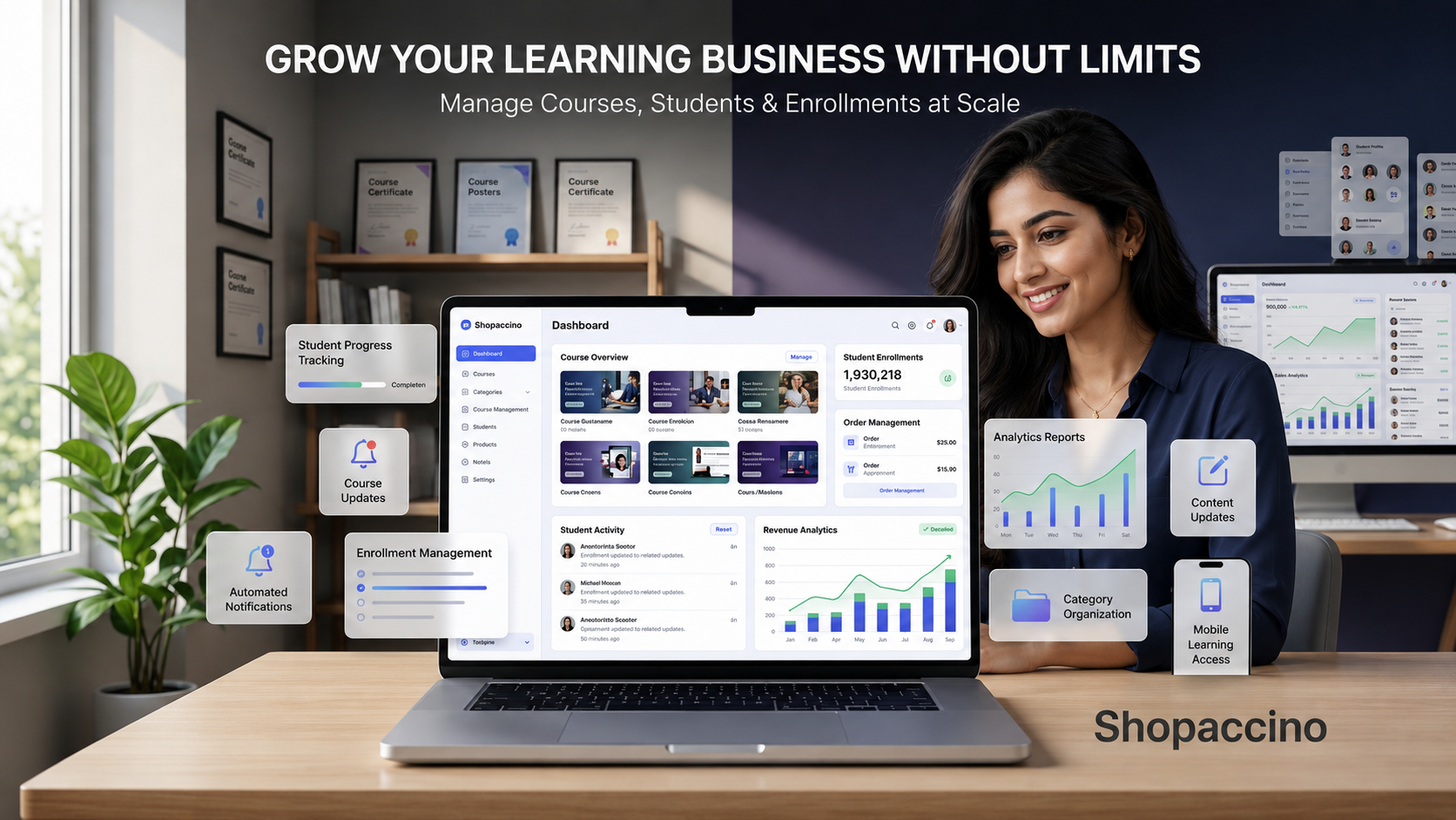
A course website that runs smoothly with five courses often needs different handling at fifty. Growth surfaces complexity that small operations hide. The right platform supports expansion without forcing you to migrate every two years.
Adding New Courses
As your library grows, each new course should be straightforward to add. Use the same product page template, the same content workflow, and the same access rules as your earlier courses. Consistency makes adding the tenth course as easy as adding the second.
Managing Multiple Categories
With more courses comes the need for clearer category structure. Group courses by skill level, by topic area, or by format. Use subcategories where needed. The goal is to make sure a returning student can find their next course quickly and a new visitor can browse without getting overwhelmed.
Handling Increasing Enrolments
More students mean more order management, more support queries, and more automated communication. The platform must scale to handle peak traffic without slowing down. Look for clear performance during sale events and reliable email delivery for confirmation messages even at high volumes.
Updating Course Content
Courses are not static. New lessons get added. Old material gets refreshed. Pricing changes. The platform should make these updates easy. Bulk price changes, scheduled content releases, and clear version control all matter when you have a library that needs regular maintenance.
Improving User Experience
With data on how students browse, buy, and learn, you can refine the website over time. Better course recommendations, faster search, clearer dashboards, and smarter automated communication all become possible. The growth of an online learning platform is as much about refining the experience as it is about adding more courses.
Building a Long Term Course Selling Foundation
Approaching Online Course Website Development the right way pays off for years. The platform you choose shapes how students browse, enrol, log in, learn, and return. A good choice quietly supports the business as it grows. A poor choice forces a migration just as the audience starts to matter.
Look for a platform that handles the basics cleanly. Product catalogue management for your courses, student accounts, secure payment gateway support, automated communication,
course access management, responsive design, and a reliable checkout. Custom features and advanced workflows can be layered on later, but the foundation must be solid from day one.
Shopaccino is SaaS ecommerce software anyone can use to build a branded website for online courses. Each course becomes a product in your catalogue, customer accounts handle student login and access, the integrated checkout processes payments, and the dashboard manages every enrolment from a single screen. The platform provides the store side cleanly. The course content and the student relationships remain yours to build.
Then comes the actual work. Plan your course pages carefully. Write descriptions that help students decide. Set up payments and access rules with care. Launch, take enrolments, learn what works, and refine every month. That is how a small course idea becomes a real course selling business. For a focused look at launching a self-paced learning platform as an educator, see our guide on how educators can launch self-paced learning platforms.
FAQs
Online course website development is the process of building a website where students can browse, buy, and access online courses. It combines ecommerce functionality with content delivery features, so each course is listed as a product, students log in to access their purchases, and the website handles payments, enrolments, and customer communication.
The best platform depends on what you teach, where your students are, and how much you plan to grow. Look for one that handles product catalogue management, customer accounts, secure payments, multi currency support, and a clean dashboard. Shopaccino is one of the SaaS ecommerce platforms designed for businesses building branded course selling websites.
Yes. Modern ecommerce website builders are designed for non technical users. You can launch a complete course selling website using only the dashboard, with no coding, no developer, and no server management. Most course websites today are built on platforms rather than from scratch.
Yes. Shopaccino is SaaS ecommerce software that supports building a branded website where each course is listed as a digital product. The platform handles the storefront, payment gateway integration, customer accounts, and order management. Video lessons are typically hosted on a separate paid video hosting service, with the player embedded into the course page using the video URL.
Most students browse and buy courses on phones. A mobile-friendly website ensures the course pages, checkout, and student dashboard look clean, load fast, and work smoothly on any device. Without responsive design, you lose most of your potential students before they ever reach the enrolment button.
A payment gateway is a service that securely processes online payments between the student's bank and your business account. When a student pays, the gateway encrypts the transaction, verifies it with the bank, and confirms success or failure to your website. Modern ecommerce platforms integrate with multiple gateways so you can accept cards, UPI, wallets, and other methods.