
The Science Behind High-Converting Product Pages
Two stores sell the exact same product. Same price, same photos, roughly the same traffic. One converts at 1 percent. The other converts at 4 percent. The difference almost never comes down to the product itself. It comes down to the page.
Buying decisions online happen fast, often in under a minute, and they run on psychology as much as they run on product quality. Understanding what actually drives that decision is what separates high-converting product pages from pages that just sit there collecting traffic without turning it into sales.
Quick Answer High-converting product pages work because they reduce mental effort, build trust quickly, and guide attention toward a decision instead of away from it. The strongest pages combine clear visuals, honest social proof, smart price framing, and minimal friction between interest and checkout, all backed by well-documented principles of buyer psychology. |
Why Do Some Product Pages Convert Better Than Others?
Most ecommerce stores sit somewhere between 1 and 3 percent conversion rate, meaning out of every 100 visitors, only a couple actually buy. Pages that consistently outperform that range usually aren't doing anything flashy. They're doing a handful of specific things that align with how people actually make decisions, not how brands wish they made decisions.
A shopper landing on a product page isn't reading it line by line like an essay. They're scanning, forming quick judgments, and looking for reasons to trust the purchase or reasons to leave. Every element on the page either helps that decision along or adds friction to it. Understanding the psychology behind that process is what turns page design from guesswork into something you can actually engineer.
It also explains why two brands can run nearly identical products through nearly identical ad campaigns and still see wildly different results. The traffic isn't the variable. What happens in the few seconds after someone lands on the page is.
What Psychological Principles Drive High-Converting Product Pages?

None of this is new. Behavioral psychology has studied decision-making for decades. What's changed is how directly ecommerce brands can apply it, element by element, on a single page.
Why Does Cognitive Load Kill Conversions?
Cognitive load is the mental effort it takes to process information. Every extra decision, unclear label, or cluttered layout adds to that load, and tired brains take the easiest way out, which is usually leaving the page. High-converting pages keep cognitive load low on purpose. One clear headline, one dominant image, one obvious call to action. Anything that makes a shopper stop and think "wait, what does this mean" is working against the sale, not for it.
How Does Social Proof Influence Buying Decisions?
People trust other people more than they trust brand copy. That's the entire logic behind reviews, ratings, and user photos, they let a shopper borrow someone else's judgment instead of relying entirely on their own. Product pages that place review counts and star ratings near the price, not buried at the bottom, tend to convert better simply because that proof arrives at the exact moment doubt would otherwise creep in.
Why Does Loss Aversion Work Better Than Just Listing Benefits?
People feel the pain of losing something roughly twice as strongly as they feel the pleasure of gaining something equivalent. That's loss aversion, and it's why phrases like "only 3 left in stock" or "sale ends tonight" tend to move shoppers who were otherwise sitting on the fence. This only works when it's genuinely true. Fake urgency gets noticed fast, and once a shopper catches one dishonest countdown timer, they stop trusting every other signal on the page too.
What Role Does Visual Hierarchy Play In Guiding Attention?
Eyes move in predictable patterns, usually top to bottom, left to right, drawn first to the largest or highest contrast element on the page. High-converting product pages use that pattern deliberately: product image first, price and core benefit next, then supporting detail, then the call to action sitting where the eye naturally lands last. When hierarchy is random, so is what a shopper actually reads before deciding to leave.
Why Do Trust Signals Matter More Than Most Brands Assume?
Buying from a website is still an act of trust, especially for a first time customer who's never dealt with the brand before. Secure checkout icons, clear return policies, real customer photos, and visible contact information all lower the perceived risk of that transaction. This matters even more for higher priced items like furniture, marble and stone products, or electronics, where the cost of getting it wrong feels bigger to the buyer.
How Does Scarcity And Urgency Actually Affect Buyer Behavior?
Limited stock or time bound offers work because they force a decision now instead of "maybe later," and later, for most online shoppers, quietly becomes never. The effect is real, but it's also fragile. Scarcity that reflects actual inventory builds trust. Scarcity that resets every time the page reloads destroys it. The tactic only works as long as it stays honest.
Why Does Anchoring Change How Shoppers Perceive Price?
The first number a shopper sees becomes the reference point for every price judgment after it. A strikethrough original price next to a discounted one isn't just a discount, it's an anchor that makes the second number feel like a win rather than a cost. The same principle explains why showing a higher tier product first, before a mid range option, often makes that mid range option feel more reasonably priced by comparison.
How Does Friction In Page Layout Reduce Conversions?
Friction is anything that slows a shopper down between wanting the product and actually buying it. A size chart that opens in a new tab, a shipping cost that only appears at checkout, an add to cart button that disappears when scrolling, these all add tiny amounts of friction that individually seem small but add up to real drop off. High-converting pages remove friction aggressively, often more aggressively than brands feel comfortable with at first.
How Does The Paradox Of Choice Affect Product Page Design?
More options don't always mean more sales. Past a certain point, additional variants, colors, or bundled add-ons make a decision harder instead of easier, and a shopper facing too many choices often makes none at all and leaves. This shows up constantly on product pages that try to cross-sell five related items above the fold. Highlighting one clear default option, with related products available but visually secondary, respects the same psychology that makes a short menu easier to order from than a twenty page one.
What Should Every High-Converting Product Page Actually Include?
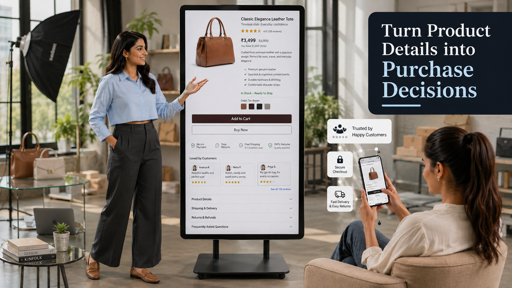
Put the psychology into a checklist and it looks like this.
Page Element | Why It Actually Works |
|---|---|
High resolution, zoomable images | Reduces uncertainty about texture, color, and quality since the shopper can't physically touch the product |
Clear, benefit-led headline | Lowers cognitive load by telling the shopper immediately what matters, instead of making them figure it out |
Reviews and ratings near the price | Delivers social proof at the exact moment price-related doubt shows up |
Anchor pricing with visible comparison | Uses the anchoring effect so the actual price feels like a fair deal, not just a number |
Trust badges and secure checkout icons | Lowers the perceived risk of an unfamiliar transaction, especially for first time buyers |
Honest stock or delivery timing indicators | Applies scarcity and urgency without relying on fake countdowns that damage trust |
Sticky add to cart button | Removes friction by keeping the call to action reachable no matter where the shopper scrolls |
FAQ section on the page itself | Resolves objections before they turn into a bounce, instead of forcing an email to support |
Visible shipping and return policy | Removes last-minute hesitation that often shows up right before checkout |
How Does This Play Out Differently Across Industries?
The psychology stays the same, but which principle matters most shifts depending on what's being sold.
- Fashion: visual hierarchy and social proof dominate, since sizing and fit concerns are usually solved by seeing real customer photos and honest reviews rather than a size chart alone
- Electronics: trust signals and detailed specifications carry more weight, since buyers are cautious about compatibility, warranty, and return terms before committing
- Home decor: cognitive load reduction matters most, room-context photography and clear dimensions help shoppers picture the product in their own space without extra explanation
- Marble and stone: trust and specification clarity are everything, weight, finish, and slab dimensions need to be exact, since buyers, often B2B, are making high value decisions on photos alone
- Beauty: social proof and ingredient transparency drive the decision more than price, since repeat buyers are looking for evidence something actually works
- B2B trading: friction reduction matters differently here, bulk pricing, minimum order quantities, and clear wholesale terms need to be visible upfront instead of hidden behind a quote request.
How Can You Actually Test Whether A Product Page Is Converting?
None of this should be applied on instinct alone. The point of understanding the psychology is to form better hypotheses, then test them against real data.
- Conversion rate: the percentage of visitors who complete a purchase, the single most direct measure of whether the page is doing its job
- Add to cart rate: shows whether the page is generating interest even if checkout isn't completing, which usually points to a pricing or trust issue rather than a product issue
- Bounce rate: a high bounce rate on a product page usually means cognitive load or load speed is pushing people out before they even engage
- Time on page: very short visits suggest the page isn't holding attention, while unusually long visits can signal confusion rather than genuine interest
Run one change at a time, image order, headline, price placement, and compare it against a clear baseline before assuming it worked. Guessing which principle mattered most without testing it is how a lot of redesigns end up making conversion worse instead of better. It's also worth tracking these numbers by device separately, since a page that performs well on desktop can quietly underperform on mobile if buttons, images, or load speed weren't tested there specifically.
Why Does Mobile Experience Matter So Much For Conversion?
Most product page traffic today comes from a phone, not a desktop, which changes which psychological principles matter most. Thumbs, not cursors, decide whether a call to action gets tapped, and a page that requires pinching to zoom into a product photo or scrolling past a slow-loading banner before reaching the price is adding friction at the exact moment a shopper was ready to buy. Cognitive load also compounds faster on a small screen, since there's less room to spread information out, which is why the pages that convert best on mobile tend to be the ones that say less, not more, above the fold.
What Role Does The Platform Play In Product Page Performance?

Psychology gets you the right layout on paper. The platform behind the page determines whether that layout actually loads fast, displays accurate stock, and holds up once real traffic hits it. A page with perfect copy and photography still loses sales if it loads slowly, shows a product as available when it's actually out of stock, or breaks on mobile, and mobile is where most of this traffic is coming from in the first place.
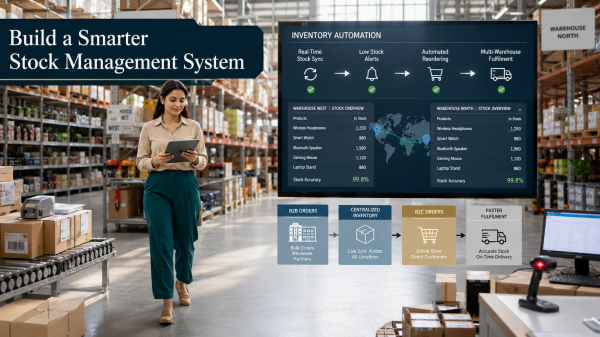
This is where Shopaccino's built-in automation matters more than it looks at first glance. Because inventory across multi-warehouse order fulfilment stays synced automatically, stock indicators on the page reflect what's genuinely available instead of quietly overselling and eroding trust after the fact. For brands selling across regions, built-in multi-currency and region-based pricing means the price a shopper sees is already correctly localized, without the jarring conversion-rate math that happens when a store shows one currency and charges another at checkout. And since integrated payments and zero transaction fees keep checkout simple and predictable, one of the most common sources of last-minute friction, an unexpected fee at the final step, never shows up in the first place.
What Common Mistakes Hurt Product Page Conversions?
- Stock photos instead of real product images, which quietly signals a lack of authenticity even when the product itself is genuine
- Reviews buried below the fold, where they arrive too late to influence the actual buying decision
- Fake urgency, countdown timers that reset, stock counts that never change, which damage trust the moment a shopper notices
- Hiding shipping costs until checkout, which is one of the single biggest causes of cart abandonment across ecommerce
- Overloading the page with every possible detail at once instead of letting hierarchy guide what matters first
Final Thoughts
Building high-converting product pages isn't about tricking anyone into buying something they don't want. It's about removing the friction, doubt, and mental effort that stop a genuinely interested shopper from following through. Clear visuals, honest social proof, smart price framing, and a platform that keeps stock and pricing accurate behind the scenes do more for conversion than any clever headline ever will. Get the psychology right, keep it honest, and the page starts doing the selling on its own.
FAQs
Pages that reduce mental effort, build trust quickly through reviews and clear policies, and remove friction between interest and checkout convert best. It's less about flashy design and more about aligning the page with how people actually make quick decisions.
Near the price, not at the bottom. Doubt about value usually shows up right when a shopper sees the price, so having ratings and reviews visible at that moment resolves hesitation before it turns into a bounce.
Yes, when it's genuinely accurate. Real stock counts or real time bound offers push undecided shoppers to act. Fake urgency, like countdowns that reset, tends to backfire once shoppers notice, damaging trust in every other claim on the page.
Very. Slow loading pages increase bounce rate before a shopper even sees the product, regardless of how good the copy or photography is. Speed is often the first psychological signal of trust a page sends, before a single word is read.
Test one change at a time, like image order or price placement, against a clear baseline using real traffic data. Relying on instinct alone often leads to redesigns that look better but convert worse.